Leveraging usability heuristics to unify complex service touchpoints for university staff
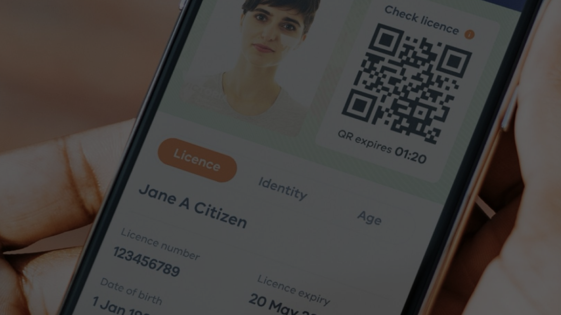
This year, I delivered a user-centred strategy for a staff support platform to help the employees of a major university to access key IT, finance, HR and procurement services. The strategy was one part of a huge overhaul; a significant investment had been made in customer support and new technology platforms to help a vast cohort of staff (everyone from tenured professors to the most junior marketing staff) to get the support they need to do their jobs.
Challenge
Once the strategy was delivered, the real work began, with each of the streams having to deliver 9 key multichannel experiences that made up the support network (service desks, self-service technology, ticketing etc). I was asked to check back in and found that most of the heavy lifting had been done but the interactions weren’t yet unified across touchpoints. Although a tremendous amount of work was being done to vastly improve access to support, for members of staff to feel the benefit of this effort and to opt for self-service online - instead of consistently calling for support - it needed to be as easy and intuitive as possible for people to use the digital touchpoints available to them. This is where usability analysis really becomes useful.
Approach
I still find Nielsen’s heuristics the best possible way to analyse whether an end-to-end experience presents content and interactions in a way that works best for the user. The 10 heuristics are as follows:
Visibility of system status. Is it clear to users what is going on at each stage of their task completion?
Match between system and the real world. Are we using words, phrases and concepts that are familiar to the user?
User control and freedom. When users make a mistake, will it be easy for them to undo that mistake?
Consistency and standards. Do users have to wonder whether different words, situations, or actions mean the same thing throughout the end-to-end experience?
Error prevention. Is the experience designed to prevent a problem from occurring through both intuitive design and confirmation options before users commit to an action?
Recognition rather than recall. Are we relying on users remembering instructions hosted on one part of the experience to be able to navigate another part of it?
Flexibility and efficiency of use. Does the experience cater to both inexperienced and experienced users?
Aesthetic and minimalist design. Are we removing irrelevant or rarely needed information and design elements?
Help users recognise, diagnose, and recover from errors. Are error messages expressed in plain language, do they precisely indicate the problem, and do they constructively suggest a solution?
Help and documentation. Are we providing additional help and documentation that is easy to find, should the user need it?
Outcome
By using these objective and clear markers, I was able to show screen-by-screen and script-by-script how content and interactions could be improved, grading each of the scenarios on whether they were on track, needed to be improved or had to be completely rethought.
When we are working on huge transformations, mapping across many touchpoints, it is easy to lose focus on the granular UI and content details that can really make or break an experience for the user. This is why CX strategists benefit greatly from having been a product designer at some stage, or at least a practitioner that understands both macro and micro needs. It was also great to know how helpful Nielsen’s heuristics still are, over 20 years after they were first conceived.